Alive - Another Video of Instagram

I quite like photography and video app, that’s why I like to browse on App Store to see any interesting everyday. Today, I found Alive. My first impression is “Wow, another Instagram”, but after using a few minutes, I found it still has much more features which I would like to share with you. Get the Alive on iTunes here.
[om/alive-another-video-instagram/alive_03_home/)
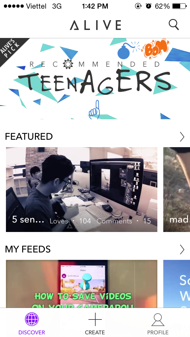
Launch the app and a new feeds with Featured, and My Feeds appear, usual like any social network app out there.
[om/alive-another-video-instagram/alive_05_search/)
Perform some searches, and it works as expected.
[om/alive-another-video-instagram/alive_01_blankanimation/)
However, I do not like the loading animation here, it is hard to see and I just thought the app was frozen.
[om/alive-another-video-instagram/alive_04_profile/)
View some body profile, found no interesting here. UI parts are somehow messy.
[ om/alive-another-video-instagram/alive_02_comment/)
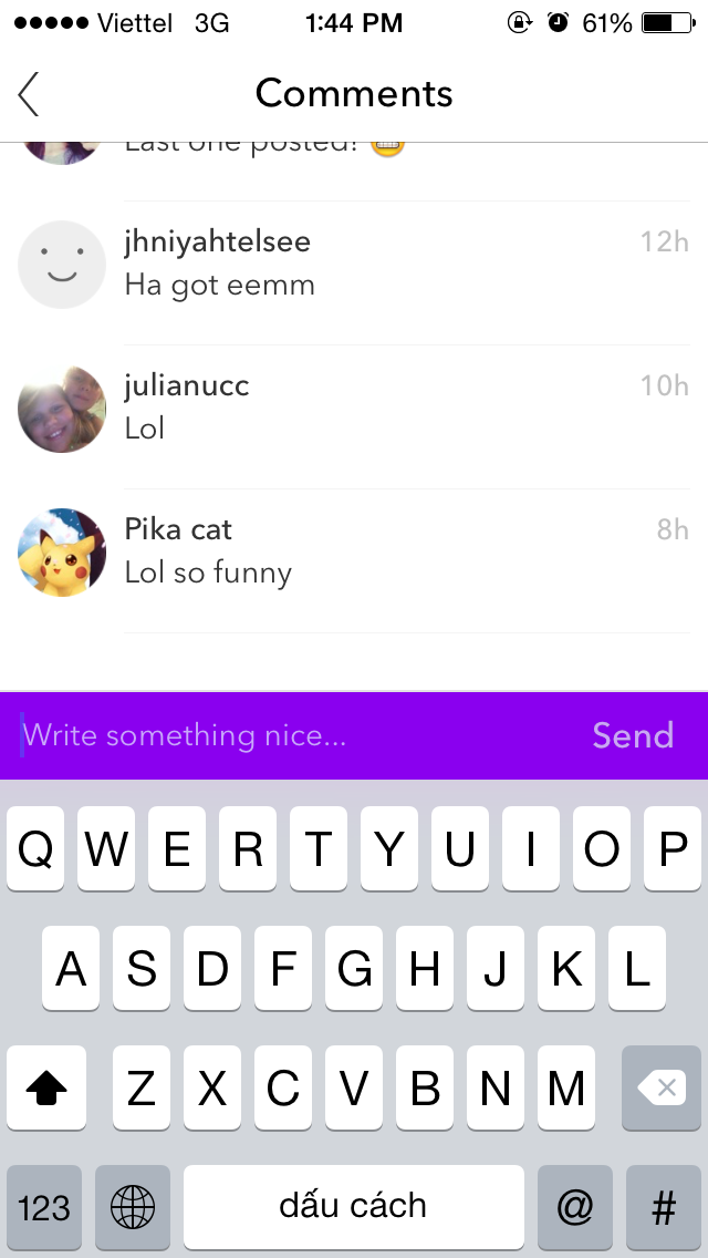
Comment section makes me think about what did Instagram do?
[om/alive-another-video-instagram/alive_06_share/)
Alive has separate Sharing screen, I prefer a context menu like a popup instead a whole new screen for just sharing.
[om/alive-another-video-instagram/alive_07_video/)
Watch a video. Actually, video is not really focused here with too much white elements.
[om/alive-another-video-instagram/alive_08_me/)
What about My Profiles? I see a really, really another Instagram here.
[om/alive-another-video-instagram/alive_09_settings/)
Settings section allows you to choose save high or low or orginal quality and auto-playing settings.
[om/alive-another-video-instagram/alive_10_portrait/)
I decide to create a video for myself. And now the fun part, I must not use the phone in portrait mode.
[om/alive-another-video-instagram/alive_11_landscape/)
Fine, landscape is allowed now.
[om/alive-another-video-instagram/alive_12_record/)
Start recording. UI seems like an Xperia smartphone.
[om/alive-another-video-instagram/alive_13_tutorial/)
It also displays a nice tutorial about available gestures inside recording.
[om/alive-another-video-instagram/alive_14_object/)
Awww, I can add a visual effect object here.
[om/alive-another-video-instagram/alive_15_music/)
Choose music from pre-come, or from my own library which is good as well.
[om/alive-another-video-instagram/alive_16_vfx/)
I decide to remove last VFX object and add another, it is quite easy but hard to create an awesome one.
[om/alive-another-video-instagram/alive_17_text/)
Alive supports Text layer too, and vector shapes as well.
[om/alive-another-video-instagram/alive_18_slide/)
Using this slide-like UI, I can make our text moving on or fade in/out easily.
[om/alive-another-video-instagram/alive_19_filter/)
Video filters are also available to play with.
[om/alive-another-video-instagram/alive_20_publish/)
Publish my video. It’s showtime!

