
Beauty Me Case Study: Mockup and UI Design

In previous post, we planned and created timeline for Beauty Me – a mobile-first application. Today, we will desribe more about how next phase was done – The mockup and User Interface design.
In desktop environment, you should be familiar with something like Swing or GWT for Java, or Windows Presentation Foundation, WinForm for .NET,… They are basic GUI Toolkit for desktop class, and thus you will do not too much task about user interface. But in contrast, in mobility environment, everything users know are about interface. They don’t care how much complex behind your app, or what algorithm you are using. They care only about smooth, responsiveness and transition over the app. You can achieve a good UI, then you will score! We understand the important of designing a good UI, and we started from first basic UI: a mockup.
There are many mockup tools outhere. We have from free, open source, basic mockup tool, to even complex, big and expensive one. However, you will find best suitable mockup tool for you at the first place, is a pencil with paper. We go for a 3-steps to create and refine mockup for our app. But first, you have to know about different between a wireframe, and a mockup:
A wireframe is about functionality. It can be a really simple sketch that demonstrates what sort of things you can do in your design. For example, a wireframe of a website will show the navigation, the main buttons, the columns, the placing of different elements. You can think of it as a bluprint for a website.
A mockup is a realistic representation of what the product will look like, in this case a website. The final result can look exactly like the mockup, or be a variation of it after version revisions. While some people prefer to draw the mockups using graphic software, others do it straight in HTML/CSS.
First step: With paper and pencil
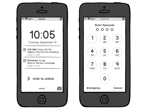
Ok, first, we have an idea, then we describe it, and outline it so it can really work, if we implement well. Now we need to image how can our idea flow on screen. You have to draw all screens, then connect them by an arrow with description about how user can get from a screen to another. In each screen, you will draw only important elements, like main buttons, text fields, image regions, so you will have an overview about how data can flow across your app. For example: you have a login screen, then you will draw an username field, then a password field and a button to login. That may be the simplest case. But then, you will ask yourself: can user skip login and use app without logging in? What can user do if he forget his password? You will start to adjust UI, create another link to “Forgot password”, make a small button for user to “Skip Login” and so on. We now have a wireframe, we will go to next step, transform from this wireframe to usable mockup.
[om/content/images/2015/07/BeautyMe_Drawing.jpg)
Second step: With software
Note that while we have many tools, even mobile app out there to help us with wireframing. We prefer to use pencil and paper, because it does not require a device like computer or tablet to use, and everybody in the team can discuss and create wireframe without any knowledge about those tools. But after we had the wireframe, it’s time to use software. We need to transform those wireframes onto a mockup, which can be display on real screen, give us a perspective about how our app will really run. We have a few choices for mockup with mobile app, just like Omni Graffle (warning: very expensive), or we can use more general graphics tools, like Photoshop and Illustrator. But of course, best in class now is Sketch. Not only specified design for mobile app, but Sketch is very powerful vector-based tool, and can be used with many plugin with held speeding design and demonstration process. With this project, we use Sketch for mockup and UI design.
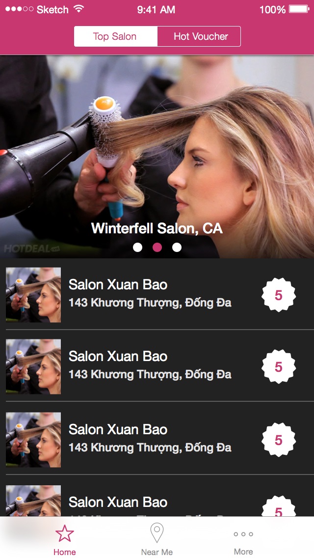
Sketch can also creates invidual assets, like icon and shape, ready to use for both Android & iOS in any resolution due to vector-based.
Third step: Theming and Branding
An important thing when you start designing user interface, you should choose an unique and elegant color scheme to be used across your app. A color scheme consists of at least 3, and usually 5 colors. We use Adobe Color (Kuler) and Coolors to create a consistent scheme. We choose 5 colors, based on the following target:
- A brand color: which should be used in main item of UI, logo, brand, primary element. It looks like blue color of Facebook or Twitter, or red color of Pinterest.
- A sub-brand color: should be more bold than brand color, which should be used when you want to have primary color, but the content is not primary, like text on header. The header should have primary color, but the text is primary content.
- A text color: which has contrast with primary color, and useful to be primary text color, it can be used with brand or subbrand color, mostly black or white (note that we should never use real black and white color 0x000000 and 0xffffff, we should use a soft black and soft white instead, for example: 0x101010 and 0xfafafa).
- A sub text color: which can be use when you want to have centralized notice label.
- A background color: which should be your primary background, contrast with brand color and text color as well.
You may try several schemes on Sketch before final decide. Please pay attention to use Sketch symbol and style for theming. Choose the best suitable one with one and others. Make minor improvements and pixel-perfect corners. Then, export them as images and push to device for real feel. When you are happy with the result, your design is ready to use in development. In next post, we will talk about how can we design app architecture and flow of data inside system.