
Material Design Support Library Tutorial - Part 1
In Google I/O 2015 event, Google announced the support library with named Android Design Support Library providing useful Material Design Components in a single library. Previous to Google announced Android Design Support Library we not easy to implement Material Design in your android application because those Material Design’s UI Component like Floating Action Button wasn’t available in Android pre-Lollipop. Now, we have a bunch of Material Design’s UI Component in Android Design Support Library.
In this article, I show you how to use Android Design Support Library to make some Material Design’s UI components for you application.
About
The demo wil show how to use:
- SnackBar
- Floating Action Button
- EditText Floating Labels
- Navigation View
- Tab Layout
- Coordinator Layout
- ToolBar and CollapsingToolBar Layout
Preparation
Create new Android project with Android Studio
- Applicatiin Name: MaterialDesignSample
- Project Name: android-material-design-support-library-sample
- Package Name: com.codentrick.materialdesignsample
Import Library
- Import android support library v7 appcompat.
- Import android design support library.
- Import cardview library
[ om/content/images/2015/08/material_design_create_add_library.jpg)
SnackBar
SnackBar shares the same concept as Toast but unlike Toast. Snackbars provide lightweight feedback about an operation. They show a brief message at the bottom of the screen on mobile and lower left on larger devices. Snackbars appear above all other lements on screen and only one can be displayed at time.
They automatically disappear after a timeout or after user interaction elsewhere on the screen, particularly after interactioin that summon a new surface or activity. Snackbars can be swiped off screen.
[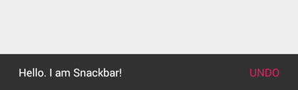
You can summon SnackBar by the code below:
Snackbar.make(someView, "Hello. I am Snackbar!", Snackbar.LENGTH_SHORT).setAction("Undo", new View.OnClickListener() {
  @Override public void onClick(View v) { }
}).show();
Snackbar will try and find a parent view to hold Snackbar’s view from the value given to view. Snackbar will walk up the view tree trying to find a suitable parent, which is defined as a CoordinatorLayout or the window decor’s content view, whichever comes first.
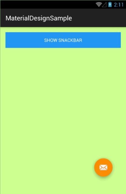
Floating Action Button
Floating Action Button (FAB) is simply a circle button with drop shadow. You can add FAB to your layout by the code below
<android.support.design.widget.FloatingActionButton
  android:id="@+id/fab"
  android:layout_width="wrap_content"
  android:layout_height="wrap_content"
  android:layout_alignParentBottom="true"
  android:layout_alignParentRight="true"
  android:src="@android:drawable/ic_dialog_email"
  app:fabSize="normal"
/>
FloatingActionButton, which extends ImageView, so many of the things you know about that control will be helpful.
android:src is used to define a resource ID of icon you want(40dp transparent png file is recommended) while app:fabSize=”nomal” is used to define FAB’s size. fabSize is a FAB’s attribute to define FAB’s size: nomal and mini.
The FAB’s shadow is automatically set to the best. In idle state is 6dp and 12dp at pressed state. You can override these values by defining app:elevation for idle state’s shadow depth and app:pressedTranslationZ for press state’s. Additions, FAB provide attributes to change backgound’s color and ripple color. You use app:backgroundTint to set FAB background’s color and app:rippleColor to set ripple’s color.
To handle click event you can use the code below
 FloatingActionButton floatingActionButton = (FloatingActionButton) findViewById(R.id.fab);
 floatingActionButton.setOnClickListener(new View.OnClickListener() {
  @Override public void onClick(View v) {}
 });
[ om/content/images/2015/08/android_design_support_floatting_action_button.jpg)
EditText Floating Labels
TextInputLayout is a greate Android’s view provided in Material Design Support Library. Text Input Layout shows the hint text to the user event if the user starts typings into the EditText by the making the hint text float above the EditText. To implment this, you could use the code below to your layout file.
<android.support.design.widget.TextInputLayout
  android:id="@+id/text_input_layout_email"
  android:layout_width="match_parent"
  android:layout_height="wrap_content">
  <EditText android:id="@+id/editText_email"
    android:layout_width="match_parent"
    android:layout_height="wrap_content"
    android:hint="Enter Email ID"
    android:inputType="textEmailAddress" /> </android.support.design.widget.TextInputLayout>

<android.support.design.widget.TextInputLayout
  android:id="@+id/text_input_layout_pass"
  android:layout_below="@+id/text_input_layout_email"
  android:layout_width="match_parent"
  android:layout_height="wrap_content">
  <EditText
    android:id="@+id/editText_pass"
    android:layout_width="match_parent"
    android:layout_height="wrap_content"
    android:hint="Enter Password"
    android:inputType="textPassword" />
</android.support.design.widget.TextInputLayout>
Navigation View
Let’s get started making an awesome Material Design Navigation Drawer for our Android app.
Add below code into your layout file
<android.support.v4.widget.DrawerLayout
xmlns:android="http://schemas.android.com/apk/res/android"
xmlns:app="http://schemas.android.com/apk/res-auto"
xmlns:tools="http://schemas.android.com/tools"
android:id="@+id/drawer_layout"
android:layout_width="match_parent"
android:layout_height="match_parent"
tools:context=".MainActivity">
<!--YOUR CONTENT LAYOUT-->
<android.support.design.widget.NavigationView
android:id="@+id/navigation_view"
android:layout_width="wrap_content"
android:layout_height="match_parent"
android:layout_gravity="start"
app:headerLayout="@layout/layout_navigation_header"
app:menu="@menu/navigation" /> </android.support.v4.widget.DrawerLayout>
```
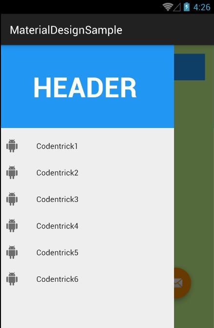
Now, you must create a new layout file for NavagationView’s header, in res/layout folder create `layout_navigation_header.xml` file.
```
<?xml version="1.0" encoding="utf-8"?>
<RelativeLayout
xmlns:android="http://schemas.android.com/apk/res/android"
android:layout_width="match_parent"
android:layout_height="150dp"
android:background="#2196F3"
android:orientation="vertical">
<TextView android:layout_width="wrap_content"
android:layout_height="wrap_content"
android:layout_centerHorizontal="true"
android:layout_centerVertical="true"
android:text="HEADER"
android:textColor="#FFF"
android:textStyle="bold"
android:textSize="50sp" />
</RelativeLayout>
```
In res/menu folder, create `navigation.xml` file to define items in Navigation Drawer.
```
<?xml version="1.0" encoding="utf-8"?>
<menu xmlns:android="http://schemas.android.com/apk/res/android">
<group android:checkableBehavior="single">
<item android:id="@+id/list_item_1"
android:icon="@drawable/ic_android_white_24dp"
android:title="Codentrick1" />
<item android:id="@+id/list_item_2"
android:icon="@drawable/ic_android_white_24dp"
android:title="Codentrick2" />
<item android:id="@+id/list_item_3"
android:icon="@drawable/ic_android_white_24dp"
android:title="Codentrick3" />
<item android:id="@+id/list_item_4"
android:icon="@drawable/ic_android_white_24dp"
android:title="Codentrick4" />
<item android:id="@+id/list_item_5"
android:icon="@drawable/ic_android_white_24dp"
android:title="Codentrick5" />
<item android:id="@+id/list_item_6"
android:icon="@drawable/ic_android_white_24dp"
android:title="Codentrick6" />
</group>
</menu>
```
You can handle clicked event in Java code
```
navigationView = (NavigationView) findViewById(R.id.navigation_view);
navigationView.setNavigationItemSelectedListener(new NavigationView.OnNavigationItemSelectedListener() {
@Override public boolean onNavigationItemSelected(MenuItem menuItem) {
drawerLayout.closeDrawers();
switch (menuItem.getItemId()) {
case R.id.list_item_1:
Toast.makeText(getApplicationContext(), "You Clicked On List Item 1", Toast.LENGTH_SHORT).show();
return true;
case R.id.list_item_2:
Toast.makeText(getApplicationContext(), "You Clicked On List Item 2", Toast.LENGTH_SHORT).show();
return true;
default:
Toast.makeText(getApplicationContext(), "You Clicked On Item :D", Toast.LENGTH_SHORT).show();
return true;
}
}
});
```
Run project to see the result.
[](/content/images/2015/08/android_design_support_navigation_view.jpg)