
Material Design Support Library Tutorial – Part 2
In the first article about Material Design Support Library I was show you how to use Android Design Support Library to implement SnackBar, Floating Action Button, TextInputLayout and Navigation View. In this article, I will show you how to use Android Design Support Library to implement more Material components.
- Tab Layout
- Coordinator Layout
- ToolBar and CollapsingToolBar Layout
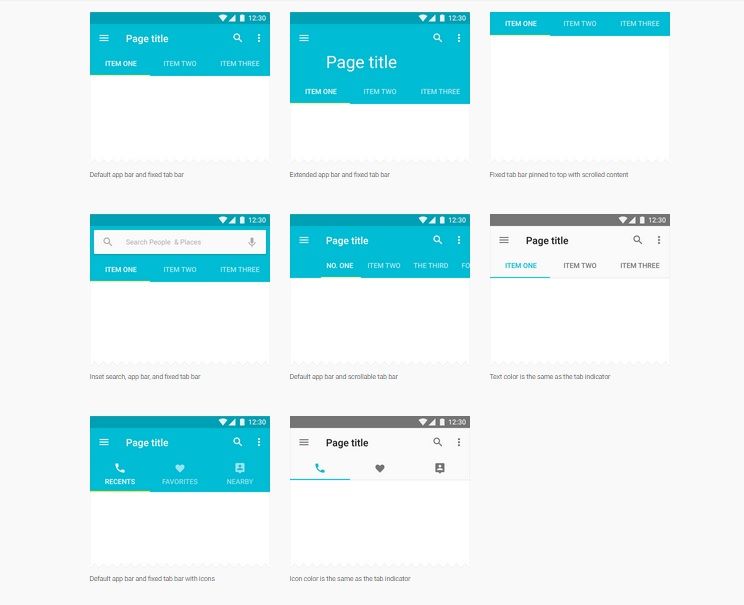
Tab Layout
Tabs make it easy to explore and switch between different views or functional aspects of an app or to browse categorized data sets.
[ om/content/images/2015/08/android_design_support_tabLayout.jpg)
To implement TabLayout to your apps, the firs you must add TabLayout widget into your layout file like the code below.
<android.support.v7.widget.Toolbar
  android:id="@+id/toolbar"
  android:layout_width="match_parent"
  android:layout_height="?attr/actionBarSize"
  android:background="#2196F3" />
  <android.support.design.widget.TabLayout
    android:id="@+id/tabLayout"
    android:layout_width="match_parent"
    android:layout_height="wrap_content"
    android:layout_below="@+id/toolbar"
    android:background="#2196F3"
    android:scrollbars="horizontal"
    app:layout_scrollFlags="scroll|enterAlways" />
Where should we place TabLayout? According to Android Application UX Guideline, Tab should be place on top of the screen not the bottom. So we will place it below ToolBar. TabLayout have some attributes that you should know.
app:tabModeyou can set it asfixedorscrollable. If you want to display every tab on the screen, set it asfixed. It good for a small number of tabs. But you have a many tabs in your screen, you should set attribute asscrollableto be displayed nicely.app:tabGravityIf you want to place all tabs in the center of the screen, you should set it as center. When you set attribute as fill, all tabs distributed in available space.
[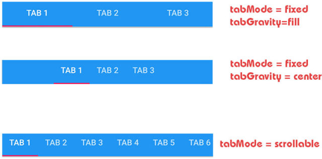 om/content/images/2015/08/android_design_support_tab_layout.jpg)
After add TabLayout in your layout file, you must add some tabs with java code.
 TabLayout tabLayout = (TabLayout) findViewById(R.id.tabLayout);
 tabLayout.addTab(tabLayout.newTab().setText("Tab 1"));
 tabLayout.addTab(tabLayout.newTab().setText("Tab 2"));
 tabLayout.addTab(tabLayout.newTab().setText("Tab 3"));
 tabLayout.addTab(tabLayout.newTab().setText("Tab 4"));
 tabLayout.addTab(tabLayout.newTab().setText("Tab 5"));
Coordinator Layout
According developer.android.com, CoordinatorLayout is a super-powered FrameLayout.
CoordinatorLayout is intended for two primary use cases:
- As a top-level application decor or chrome layout
- As a container for a specific interaction with one or more child views
By specifying Behaviors for child views of a CoordinatorLayout you can provide many different interactions within a single parent and those views can also interact with one another. View classes can specify a default behavior when used as a child of a CoordinatorLayout using the DefaultBehavior annotation.
Behaviors may be used to implement a variety of interactions and additional layout modifications ranging from sliding drawers and panels to swipe-dismissable elements and buttons that stick to other elements as they move and animate.
Children of a CoordinatorLayout may have an anchor. This view id must correspond to an arbitrary descendant of the CoordinatorLayout, but it may not be the anchored child itself or a descendant of the anchored child. This can be used to place floating views relative to other arbitrary content panes.
Now, I will show you how to add CoordinatorLayout into your apps. Add CoordinatorLayout into your layout file as root container like code below.
<android.support.design.widget.CoordinatorLayout
  xmlns:android="http://schemas.android.com/apk/res/android"
  xmlns:app="http://schemas.android.com/apk/res-auto"
  xmlns:tools="http://schemas.android.com/tools"
  android:layout_width="match_parent"
  android:layout_height="match_parent"
  tools:context="com.codentrick.materialdesignsample.LoginActivity">
  <android.support.design.widget.FloatingActionButton
    android:id="@+id/fab"
    android:layout_width="wrap_content"
    android:layout_height="wrap_content"
    android:layout_gravity="bottom|right"
    android:layout_margin="16dp"
    android:src="@android:drawable/ic_dialog_email"
    app:backgroundTint="#FB8C00"
    app:elevation="10dp"
    app:fabSize="normal"
    app:pressedTranslationZ="15dp"
    app:rippleColor="#FF80AB" />
</android.support.design.widget.CoordinatorLayout>
Done. FloatingActionButton automatically moves upward as the snackbar animates in and returns to its position when the snackbar hides.