
Material Design Support Library Tutorial – Part 3
In material design support library topic, this article is last of series. In this article, I will talk about CollapsingToolbarLayout and show you how to implement CollapsingToolbarLayout in your apps.
Collapsing Toolbar Layout
If you want to create the toolbar collapsing effect, you must wrap Toolbar inside CollapsingToolbarLayout. The layout follow the structure:
<android.support.design.widget.CoordinatorLayout >
  <android.support.design.widget.AppBarLayout >
    <android.support.design.widget.CollapsingToolbarLayout >
      <ImageView />
      <android.support.v7.widget.Toolbar />
    </android.support.design.widget.CollapsingToolbarLayout>
  </android.support.design.widget.AppBarLayout>
  <!-- Your scrollable content here -->
</android.support.design.widget.CoordinatorLayout>
CoordinatorLayout
I was talk about Coordinator in previous article. CoordinatorLayout is a powerful FrameLayout that specifies behavior for child views for various interactions. Allows floating views to be anchored in layout.
AppBarLayout
AppBarLayout is a vertical LinearLayout which implements many of the features of material designs app bar concept, namely scrolling gestures.
Children should provide their desired scrolling behavior through setScrollFlags(int) and the associated layout xml attribute: app:layout_scrollFlags.
This view depends heavily on being used as a direct child within a CoordinatorLayout. If you use AppBarLayout within a different ViewGroup, most of it’s functionality will not work.
CollapsingToolbarLayout
CollapsingToolbarLayout is a wrapper for Toolbar which implements a collapsing app bar. It is designed to be used as a direct child of a AppBarLayout.CollapsingToolbarLayout contains the following features:
- Collapsing title: A title which is larger when the layout is fully visible but collapses and becomes smaller as the layout is scrolled off screen. You can set the title to display via
setTitle(CharSequence). The title appearance can be tweaked via thecollapsedTextAppearanceandexpandedTextAppearanceattributes. - Content scrim: A full-bleed scrim which is show or hidden when the scroll position has hit a certain threshold. You can change this via
setContentScrim(Drawable). - Status bar scrim: A scrim which is show or hidden behind the status bar when the scroll position has hit a certain threshold. You can change this via
setStatusBarScrim(Drawable). This only works on LOLLIPOP devices when we set to fit system windows. - Parallax scrolling children: Child views can opt to be scrolled within this layout in a parallax fashion. See
COLLAPSE_MODE_PARALLAXandsetParallaxMultiplier(float). - Pinned position children: Child views can opt to be pinned in space globally. This is useful when implementing a collapsing as it allows the Toolbar to be fixed in place even though this layout is moving.
<android.support.design.widget.CollapsingToolbarLayout
  android:id="@+id/collapsing_toolbar"
  android:layout_width="match_parent"
  android:layout_height="match_parent"
  android:fitsSystemWindows="true"
  app:contentScrim="?attr/colorPrimary"
  app:expandedTitleMarginEnd="64dp"
  app:expandedTitleMarginStart="48dp"
  app:layout_scrollFlags="scroll|exitUntilCollapsed">
  <com.codentrick.materialdesigndemo.SquareImageView
    android:id="@+id/image"
    android:layout_width="match_parent"
    android:layout_height="wrap_content"
    android:fitsSystemWindows="true"
    android:scaleType="centerCrop"
    app:layout_collapseMode="parallax" />
 <android.support.v7.widget.Toolbar
    android:id="@+id/toolbar"
    android:layout_width="match_parent"
    android:layout_height="?attr/actionBarSize"
    app:layout_collapseMode="pin"
    app:popupTheme="@style/ThemeOverlay.AppCompat.Light" />
</android.support.design.widget.CollapsingToolbarLayout>
In java code
CollapsingToolbarLayout collapsingToolbarLayout = (CollapsingToolbarLayout) findViewById(R.id.collapsing_toolbar);
collapsingToolbarLayout.setTitle("This is title");
collapsingToolbarLayout.setExpandedTitleColor(getResources().getColor(android.R.color.transparent));
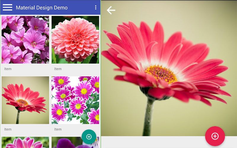
Now, you can see the result.
You can get comple source at github to show detail of awesome AndroidSupportLibrary’s components.