
Using ToolBars In Your Apps
Should we replace ActionBar by ToolBar?
My answer for the question is YES.
According developer.android.com, a Toolbar is a generalization of action bars for use within application layouts. While an action bar is traditionally part of an Activity's opaque window decor controlled by the framework, a Toolbar may be placed at any arbitrary level of nesting within a view hierarchy. An application may choose to designate a Toolbar as the action bar for an Activity using the setActionBar() method.
Toolbar supports a more focused feature set than ActionBar. From start to end, a toolbar may contain a combination of the following optional elements:
- A navigation button. This may be an Up arrow, navigation menu toggle, close, collapse, done or another glyph of the app’s choosing. This button should always be used to access other navigational destinations within the container of the Toolbar and its signified content or otherwise leave the current context signified by the Toolbar. The navigation button is vertically aligned within the Toolbar’s minimum height, if set.
- A branded logo image. This may extend to the height of the bar and can be arbitrarily wide.
- A title and subtitle. The title should be a signpost for the Toolbar’s current position in the navigation hierarchy and the content contained there. The subtitle, if present should indicate any extended information about the current content. If an app uses a logo image it should strongly consider omitting a title and subtitle.
- One or more custom views. The application may add arbitrary child views to the Toolbar. They will appear at this position within the layout. If a child view’s Toolbar.LayoutParams indicates a Gravity value of CENTER_HORIZONTAL the view will attempt to center within the available space remaining in the Toolbar after all other elements have been measured.
- An action menu. The menu of actions will pin to the end of the Toolbar offering a few frequent, important or typical actions along with an optional overflow menu for additional actions. Action buttons are vertically aligned within the Toolbar’s minimum height, if set.
In modern Android UIs developers should lean more on a visually distinct color scheme for toolbars than on their application icon. The use of application icon plus title as a standard layout is discouraged on API 21 devices and newer. But you can use ToolBar on pre-Lollipop devices(from API level 7 and up) with support library AppCompat v21.
With ToolBar:
- You can easily customize toolbar
- You can add many widgets inside toolbar
- You can add many toolbar in your view
- You have freedom to place it anywhere in the parent layout
- They have own handling/managing of it child view
In this article, I wil show you how to implement ToolBar in us apps.
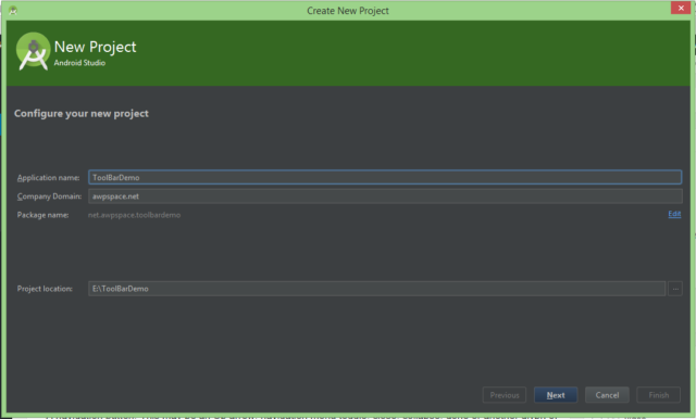
Create new project with Android Studio
Creating a new project using Android Studio is straightforward:
[ om/content/images/2015/08/android_toolbar_create_project.png)
Add Support Library
In module’s build.gradle file, add the AppCompat v7 to dependencies block.
dependencies { compile fileTree(dir: 'libs', include: ['*.jar'])
compile 'com.android.support:appcompat-v7:22.2.1' }
Edit Your Theme
In your file res/values/styles.xml, you must use the Theme.AppCompat as your base theme. I use Theme.AppCompat.Light.NoActionBar
<style name="AppTheme" parent="Theme.AppCompat.Light.NoActionBar">
  <!-- Customize your theme here. -->
</style>
If you don’t use NoActionBar theme, you must set two special attributes android:windowNoTitle and android:windowActionBar to tell Android we will be using a Toolbar instead of the Action Bar.
<style name="AppTheme" parent="@android:style/Theme.Material.Light.DarkActionBar">
  <item name="android:windowNoTitle">true</item>
  <!--We will be using the toolbar so no need to show ActionBar-->
  <item name="android:windowActionBar">false</item>
</style>
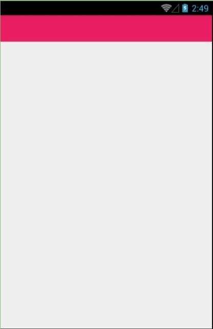
Create your ToolBar widget in XML layout file
<RelativeLayout
  xmlns:android="http://schemas.android.com/apk/res/android"
  xmlns:tools="http://schemas.android.com/tools"
  android:layout_width="match_parent"
  android:layout_height="match_parent"
  tools:context=".MainActivity">

  <android.support.v7.widget.Toolbar
    xmlns:android="http://schemas.android.com/apk/res/android"
    android:id="@+id/toolbar"
    android:layout_width="match_parent"
    android:layout_height="wrap_content"
    android:background="#E91E63"
    android:minHeight="?android:attr/actionBarSize" />
</RelativeLayout>
After add ToolBar widget in XML layout file, you can run your module and see result.
[ om/content/images/2015/08/android_toolbar_show.jpg)
Setup standalone ToolBar in code
Declare a ToolBar field, toolbar. Then we get a reference to the Toolbar widget and apply our custom settings:
Toolbar toolbar = (Toolbar) findViewById(R.id.toolbar);
toolbar.setLogo(R.drawable.icon);
toolbar.setLogoDescription("This is logo description");
toolbar.setTitle("This is title");
toolbar.setTitleTextColor(Color.parseColor("#ffffff"));
toolbar.setSubtitle("This is subtitle");
toolbar.setSubtitleTextColor(Color.parseColor("#a4a4a4"));
toolbar.inflateMenu(R.menu.menu_main);
The result:
[ om/content/images/2015/08/android_toolbar_show2.jpg)
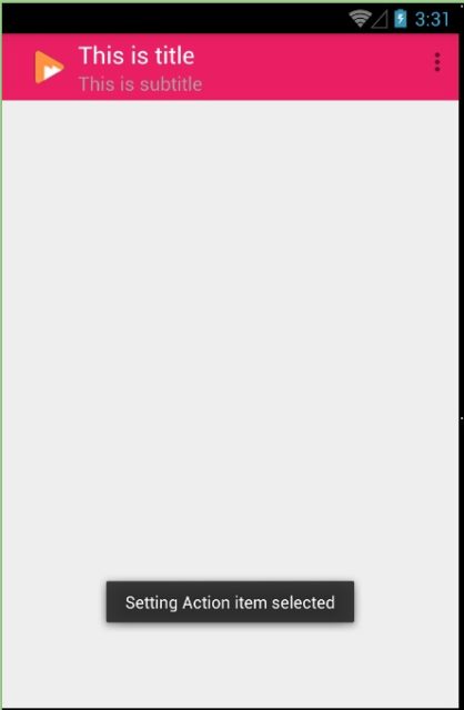
Listening for menu item selections
We need to include the Toolbar class’s setOnMenuItemClickListener() method to listen for when the menu’s Action item is selected:
 toolbar.setOnMenuItemClickListener(new Toolbar.OnMenuItemClickListener() {
  @Override public boolean onMenuItemClick(MenuItem menuItem) {
   Toast.makeText(MainActivity.this, "Setting Action item selected", Toast.LENGTH_LONG).show();
   return true;
  }
 });
[ om/content/images/2015/08/android_toolbar_show3.jpg)
Conclusion
In this article, I make the simple demo for ToolBar, but this is not fully. You must find out more about ToolBar to use this into your apps.